
Menu

Brand Guidelines
This guide defines the visual language, design style, and principles that shape a clear and consistent brand experience, no matter the team or area of expertise.
At its core, Utter is driven by a commitment to clarity and care—mirroring our mission to deliver breakthrough therapies for people living with immune-mediated diseases. These guidelines outline the key visual and communication standards that express our brand’s values: integrity, excellence, and innovation.
Whether you’re crafting a digital experience or printed collateral, this guide ensures every touchpoint aligns with Utter’s purpose.
01
Logo
The Wif Pros logo was inspired by the universally recognized wifi symbol. The bolt is a geometric abstraction of electricity that aligns with the angle of the italic sans-serif letterforms and the angle of the rounded rectangle encompassing the mark. This logo was carefully designed with balance and legibility in mind.
1a
Primary Lockup


1b
Clearspace


1c
Logo Variations


1d
Logo Color Combinations


1e
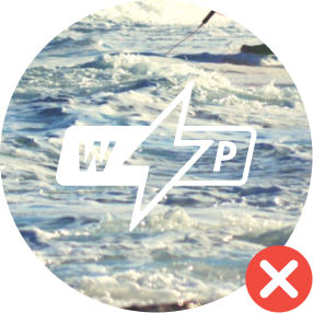
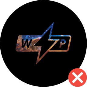
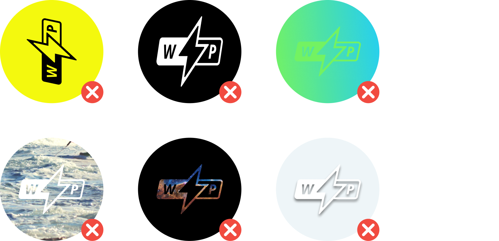
Incorrect Usage
The Wifi Pros logo is designed to be presented a certain way. Deviate from that and you compromise the brand.
Don’t alter the shape, angle, or layout of the logo in any way.
Don’t place the logo over a low contrast background.
Don’t place the logo over busy images.
Don’t apply effects or textures to the logo.


1f
Partnerships


02
Color
The colors for Wifi Pros are vibrant and energetic.
While the majority of Wifi Pros branded designs should be black, white, and off-white, we recommend adding pops of color in measured and thoughtful doses to help make content feel distinct and personable.
At least one of these brand colors should be used in Wifi Pros design materials to help reinforce the brand.
2a
Color Palette
Caribbean Blue
#24CEF3
RBG - 36, 206, 243
CMYK - 62, 0, 4, 0
Electric Green
#73F262
RBG - 115, 242, 98
CMYK - 50, 0, 87, 0
Lightning Yellow
#F4F90E
RBG - 244, 249, 14
CMYK - 10, 0, 95, 0
Sunset Orange
#F99E14
RBG - 249, 158, 20
CMYK - 0, 44, 100, 0
Danger Red
#F14B40
RBG - 241, 75, 64
CMYK - 0, 86, 78, 0
White
#FFFFFF
RBG - 255, 255, 255
CMYK - 0, 0, 0, 0
Off White
#EDEEE5
RBG - 237, 238, 229
CMYK - 6, 3, 9, 0
Mid Gray
#666666
RBG - 102, 102, 102
CMYK - 60, 51, 51, 20
Dark Gray
#2B2929
RBG - 43, 41, 41
CMYK - 69, 65, 64, 67
Black
#000000
RBG - 0, 0, 0
CMYK - 75, 68, 67, 90
03
Typography
The typeface for Wifi Pros is Manrope.
This type was chosen for its readability and usefulness in both print and digital design. Manrope is a clean, modern, geometric, sans serif font family that reinforces the brand traits of being friendly, techy, and clean.
This typeface is available for free as a Google font:
fonts.google.com/specimen/Manrope
Manrope - ExtraBold
Manrope - Regular
Manrope - Light
04
Putting it all together
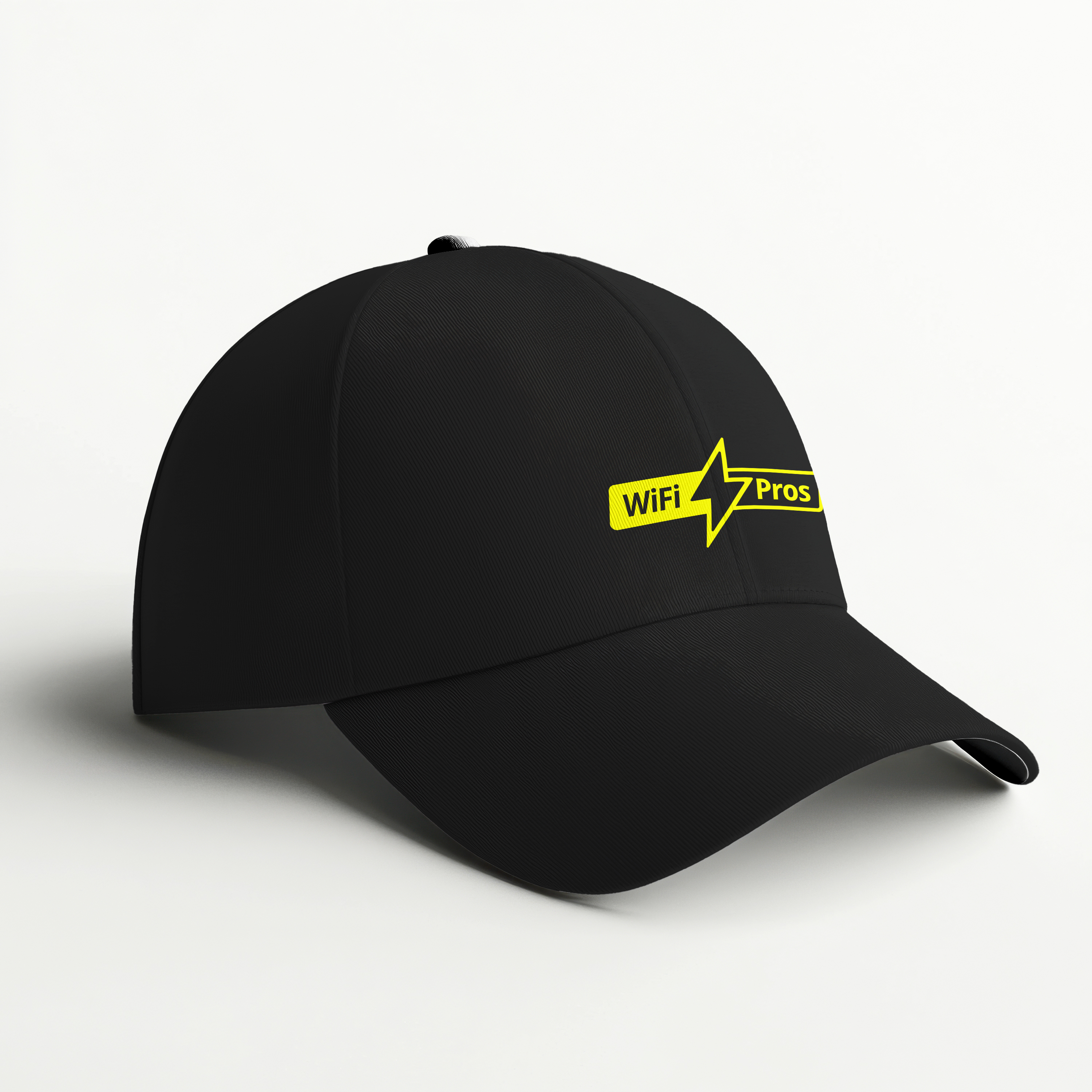
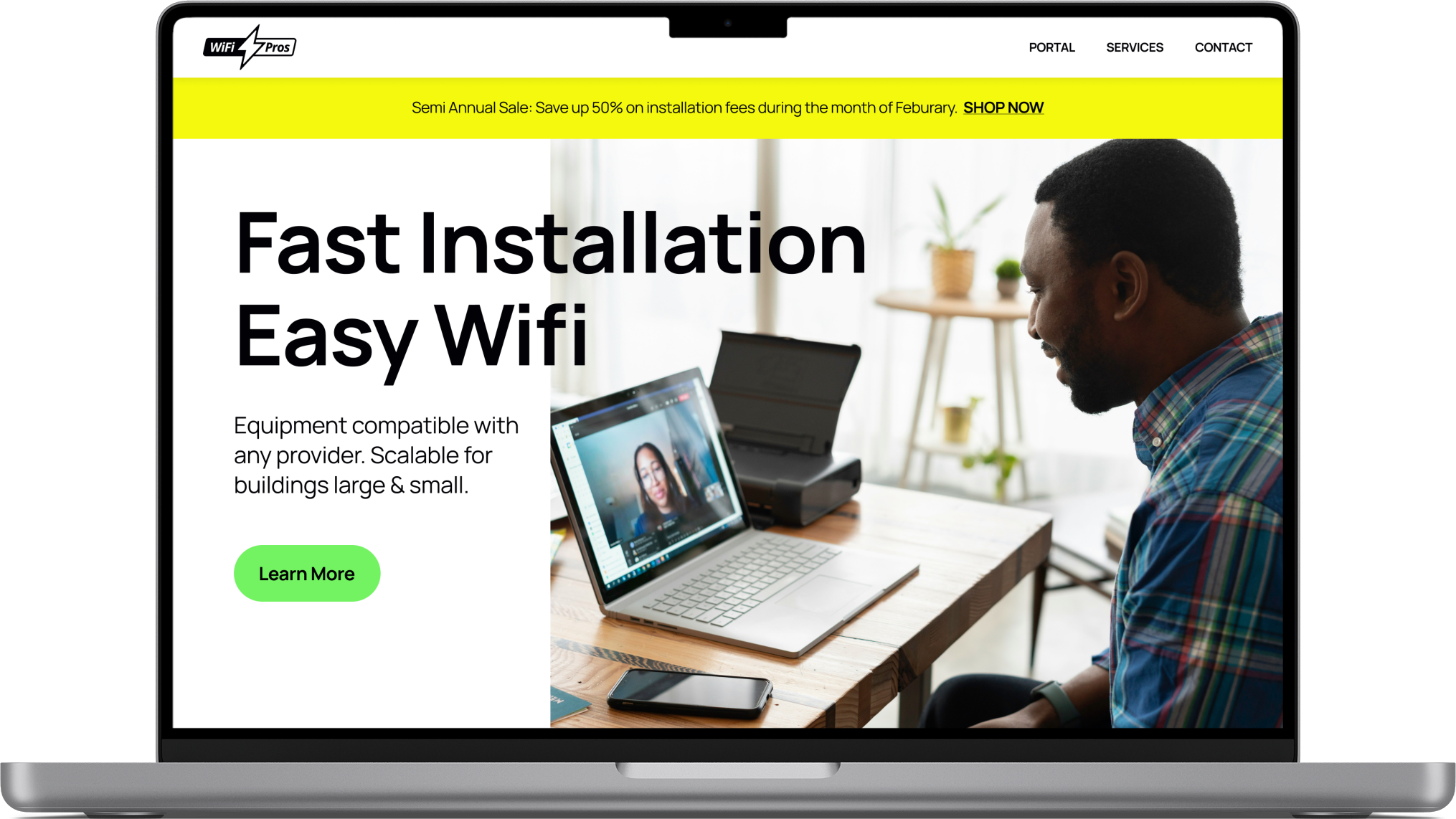
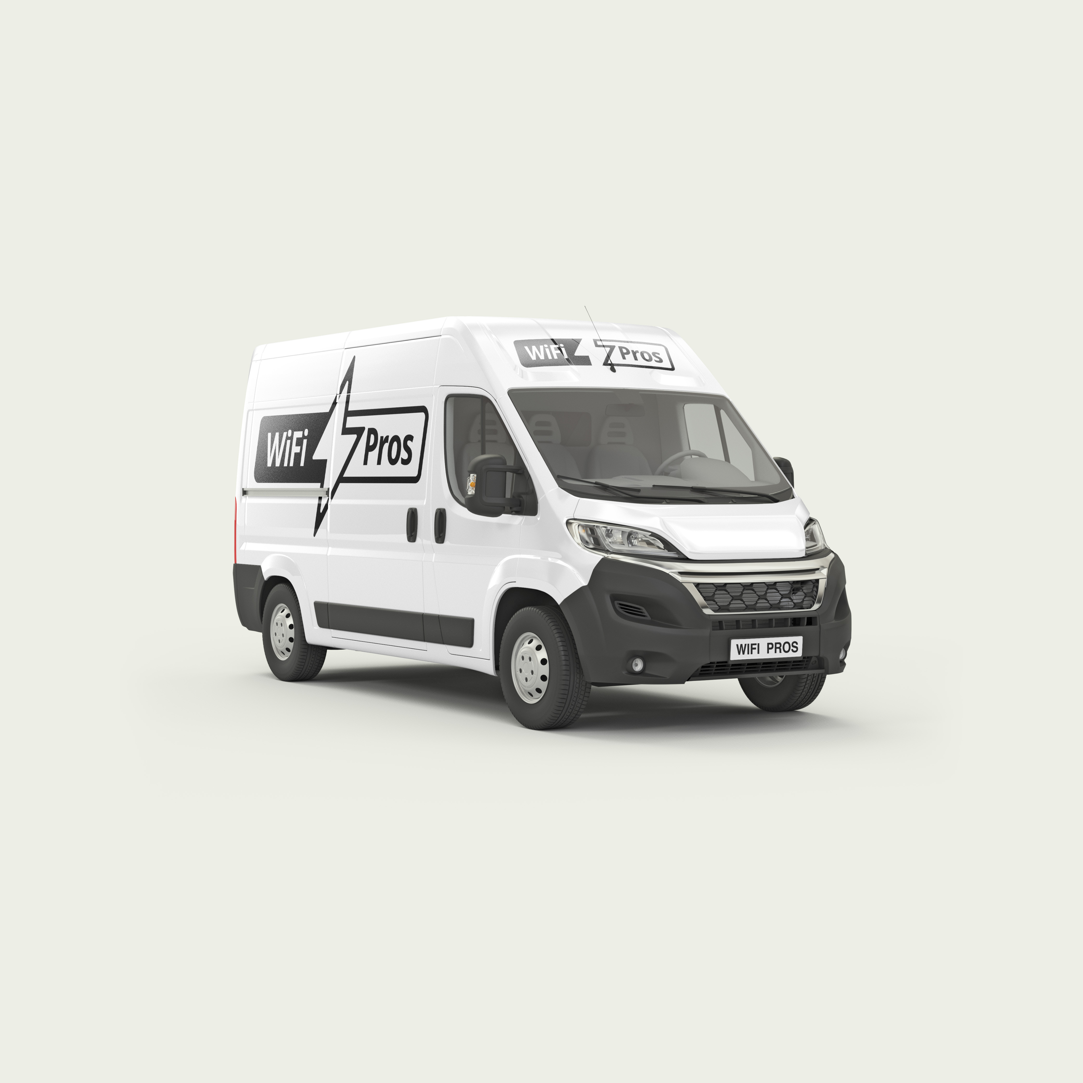
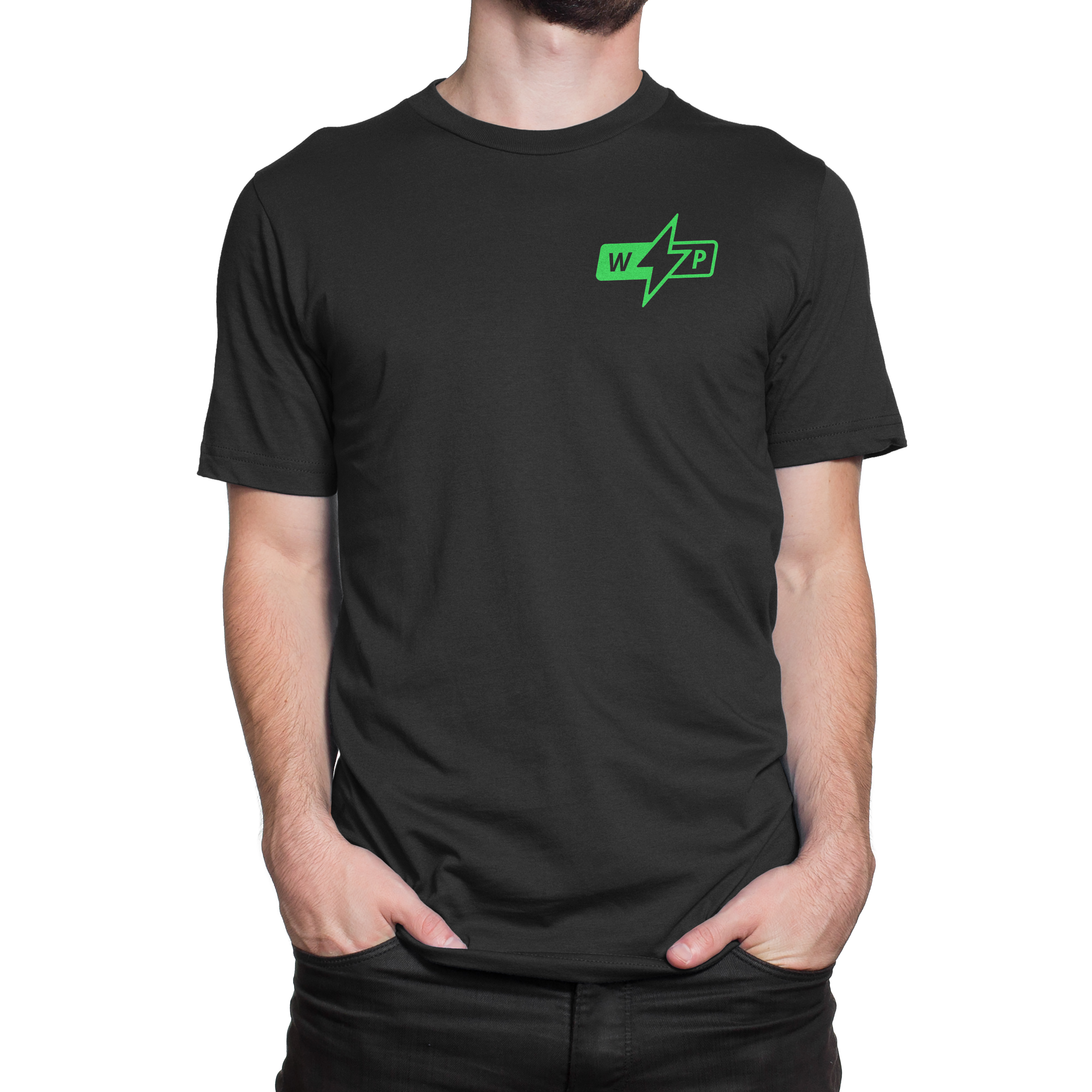
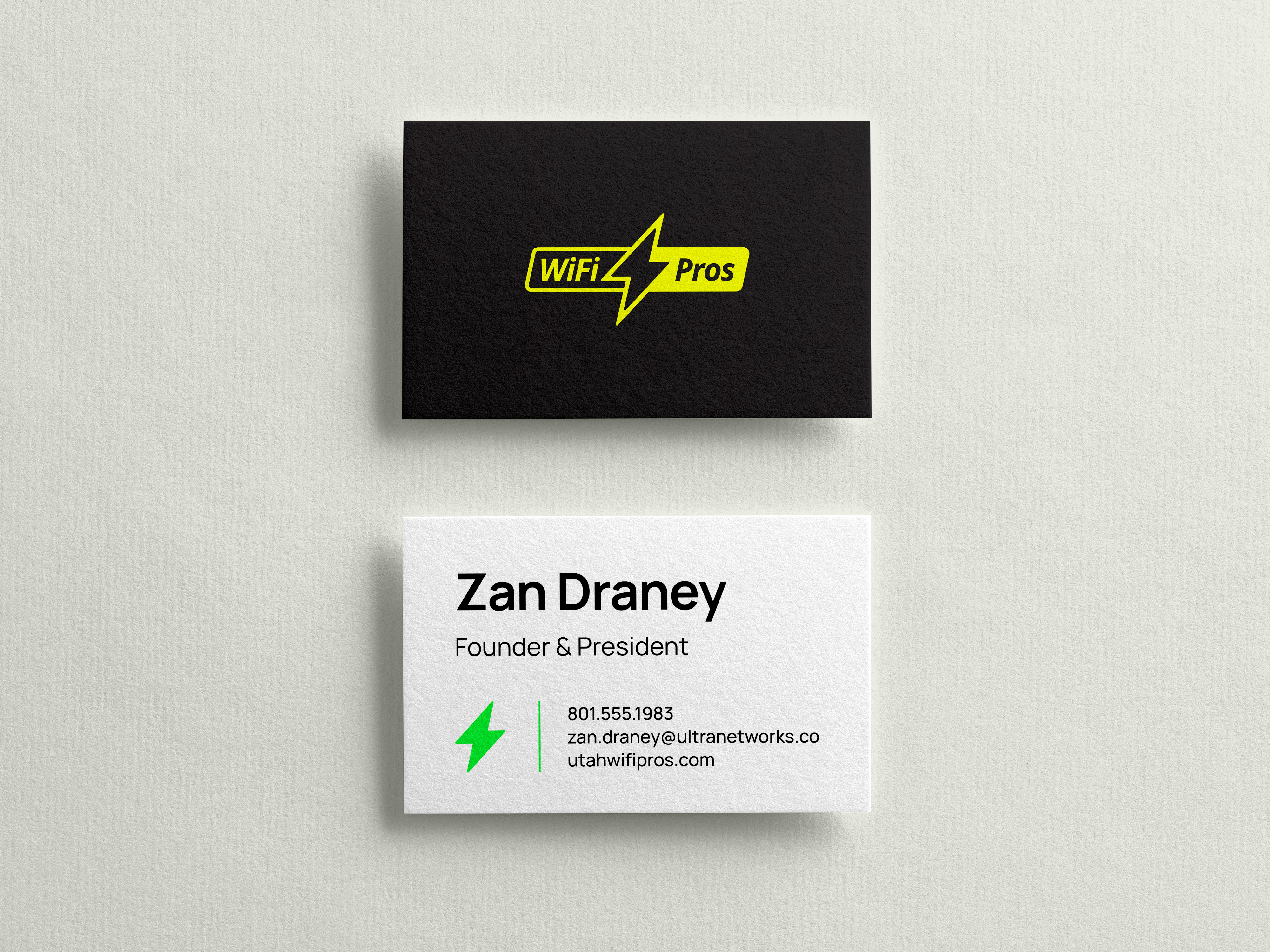
To help with brand expression and implementation we have provided some examples of how the Wifi Pros branding could be applied to a few various applications. These examples are for inspiration purposes only and should not be considered final, approved designs.
Wiring
Fiber
Ethernet
Coax
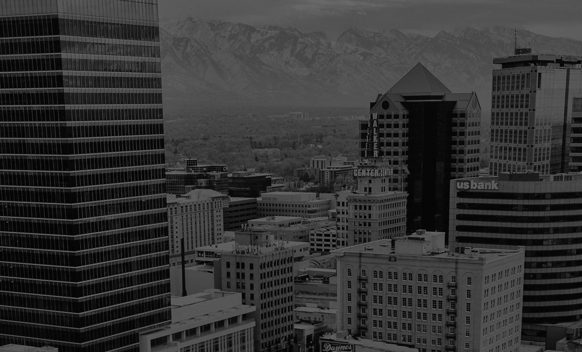
Now Servicing Davis,
Salt Lake, & Utah County


Submit a Creative Request
Back to the top
↑
Made with 💙 in Salt Lake City by Underbelly Creative.
Submit a Creative Request

Brand Guidelines
This guide defines the visual language, design style, and principles that shape a clear and consistent brand experience, no matter the team or area of expertise.
At its core, Utter is driven by a commitment to clarity and care—mirroring our mission to deliver breakthrough therapies for people living with immune-mediated diseases. These guidelines outline the key visual and communication standards that express our brand’s values: integrity, excellence, and innovation.
Whether you’re crafting a digital experience or printed collateral, this guide ensures every touchpoint aligns with Utter’s purpose.
01
Logo
The Wif Pros logo was inspired by the universally recognized wifi symbol. The bolt is a geometric abstraction of electricity that aligns with the angle of the italic sans-serif letterforms and the angle of the rounded rectangle encompassing the mark. This logo was carefully designed with balance and legibility in mind.
1a
Primary Lockup


1b
Clearspace


1c
Logo Variations


1d
Logo Color Combinations


1e
Incorrect Usage
The Wifi Pros logo is designed to be presented a certain way. Deviate from that and you compromise the brand.
Don’t alter the shape, angle, or layout of the logo in any way.
Don’t place the logo over a low contrast background.
Don’t place the logo over busy images.
Don’t apply effects or textures to the logo.

1f
Partnerships


02
Color
The colors for Wifi Pros are vibrant and energetic.
While the majority of Wifi Pros branded designs should be black, white, and off-white, we recommend adding pops of color in measured and thoughtful doses to help make content feel distinct and personable.
At least one of these brand colors should be used in Wifi Pros design materials to help reinforce the brand.
2a
Color Palette
Caribbean Blue
#24CEF3
RBG - 36, 206, 243
CMYK - 62, 0, 4, 0
Electric Green
#73F262
RBG - 115, 242, 98
CMYK - 50, 0, 87, 0
Lightning Yellow
#F4F90E
RBG - 244, 249, 14
CMYK - 10, 0, 95, 0
Sunset Orange
#F99E14
RBG - 249, 158, 20
CMYK - 0, 44, 100, 0
Danger Red
#F14B40
RBG - 241, 75, 64
CMYK - 0, 86, 78, 0
White
#FFFFFF
RBG - 255, 255, 255
CMYK - 0, 0, 0, 0
Off White
#EDEEE5
RBG - 237, 238, 229
CMYK - 6, 3, 9, 0
Mid Gray
#666666
RBG - 102, 102, 102
CMYK - 60, 51, 51, 20
Dark Gray
#2B2929
RBG - 43, 41, 41
CMYK - 69, 65, 64, 67
Black
#000000
RBG - 0, 0, 0
CMYK - 75, 68, 67, 90
03
Typography
The typeface for Wifi Pros is Manrope.
This type was chosen for its readability and usefulness in both print and digital design. Manrope is a clean, modern, geometric, sans serif font family that reinforces the brand traits of being friendly, techy, and clean.
This typeface is available for free as a Google font:
fonts.google.com/specimen/Manrope
Manrope - ExtraBold
Manrope - Regular
Manrope - Light
04
Putting it all together
To help with brand expression and implementation we have provided some examples of how the Wifi Pros branding could be applied to a few various applications. These examples are for inspiration purposes only and should not be considered final, approved designs.
Wiring
Fiber
Ethernet
Coax
Now Servicing Davis,
Salt Lake, & Utah County


Submit a Creative Request
Made with 💙 in Salt Lake City by Underbelly Creative.
Back to the top
↑

Submit a Creative Request
Brand Guidelines
This guide defines the visual language, design style, and principles that shape a clear and consistent brand experience, no matter the team or area of expertise.
At its core, Utter is driven by a commitment to clarity and care—mirroring our mission to deliver breakthrough therapies for people living with immune-mediated diseases. These guidelines outline the key visual and communication standards that express our brand’s values: integrity, excellence, and innovation.
Whether you’re crafting a digital experience or printed collateral, this guide ensures every touchpoint aligns with Utter’s purpose.
01
Logo
The Wif Pros logo was inspired by the universally recognized wifi symbol. The bolt is a geometric abstraction of electricity that aligns with the angle of the italic sans-serif letterforms and the angle of the rounded rectangle encompassing the mark. This logo was carefully designed with balance and legibility in mind.
1a
Primary Lockup


1b
Clearspace


1c
Logo Variations


1d
Logo Color Combinations


1e
Incorrect Usage
The Wifi Pros logo is designed to be presented a certain way. Deviate from that and you compromise the brand.
Don’t alter the shape, angle, or layout of the logo in any way.
Don’t place the logo over a low contrast background.
Don’t place the logo over busy images.
Don’t apply effects or textures to the logo.
1f
Partnerships

02
Color
The colors for Wifi Pros are vibrant and energetic.
While the majority of Wifi Pros branded designs should be black, white, and off-white, we recommend adding pops of color in measured and thoughtful doses to help make content feel distinct and personable.
At least one of these brand colors should be used in Wifi Pros design materials to help reinforce the brand.
2a
Color Palette
Caribbean Blue
#24CEF3
RBG - 36, 206, 243
CMYK - 62, 0, 4, 0
Electric Green
#73F262
RBG - 115, 242, 98
CMYK - 50, 0, 87, 0
Lightning Yellow
#F4F90E
RBG - 244, 249, 14
CMYK - 10, 0, 95, 0
Sunset Orange
#F99E14
RBG - 249, 158, 20
CMYK - 0, 44, 100, 0
Danger Red
#F14B40
RBG - 241, 75, 64
CMYK - 0, 86, 78, 0
White
#FFFFFF
RBG - 255, 255, 255
CMYK - 0, 0, 0, 0
Off White
#EDEEE5
RBG - 237, 238, 229
CMYK - 6, 3, 9, 0
Mid Gray
#666666
RBG - 102, 102, 102
CMYK - 60, 51, 51, 20
Dark Gray
#2B2929
RBG - 43, 41, 41
CMYK - 69, 65, 64, 67
Black
#000000
RBG - 0, 0, 0
CMYK - 75, 68, 67, 90
03
Typography
The typeface for Wifi Pros is Manrope.
This type was chosen for its readability and usefulness in both print and digital design. Manrope is a clean, modern, geometric, sans serif font family that reinforces the brand traits of being friendly, techy, and clean.
This typeface is available for free as a Google font:
fonts.google.com/specimen/ManropeManrope - ExtraBold
Manrope - Regular
Manrope - Light
04
Putting it all together
To help with brand expression and implementation we have provided some examples of how the Wifi Pros branding could be applied to a few various applications. These examples are for inspiration purposes only and should not be considered final, approved designs.
Wiring
Fiber
Ethernet
Coax
Now Servicing Davis,
Salt Lake, & Utah County


Submit a Creative Request
Made with 💙 in Salt Lake City by Underbelly Creative.
Back to the top
↑